To me there are three phases of a successful photograph. Composition, settings and editing. This blog will focus on editing. I find the editing
 schoolhouse original
process an opportunity to really become artistic, take some risks and bring a photo to life. Like in my Beautiful Mistakes blog, you can take a trash photo and find some beauty with creative editing.
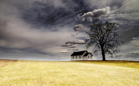
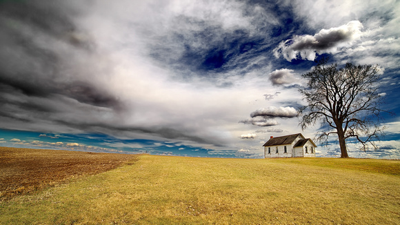
This is my original photo of an abandoned schoolhouse off Highway 63 just south of Zumbrota Falls in Southern Minnesota, USA. I stopped by earlier this week at two different times--morning with back lit sun and clear skies and then afternoon with cloudy skies and the sun at my back. Both times netted different results and I was happy with both sets of photos. This is an afternoon shot. I like these kind of shots as the subject is isolated and gives an opportunity for a clean edit. The schoolhouse and tree together with the placement at the top of a hill with nothing in front gave me a great composition opportunity.
I chose my Rokinon 14mm lens which is almost a fish-eye lens. A great lens for big-sky shots, astro photography and sweeping landscapes. It does give off some distortion as a by-product of the line of sight (almost 90 degrees) but nothing that cannot be fixed in post processing as you will see. Settings for this shot--iso100, f/16 at 1/160sec.
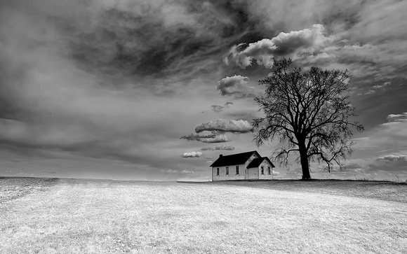
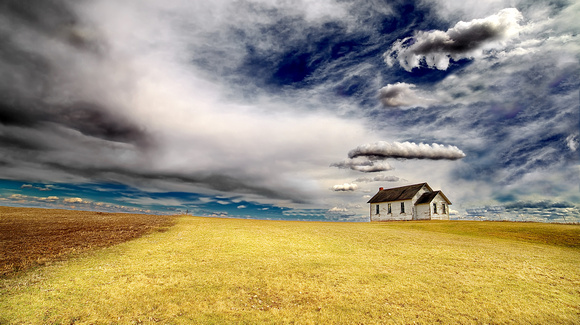
For my first edit, I chose a 5x8 aspect ratio. I also edited it with a 16x9 ratio that works well for sweeping landscapes but this photo may end up being
 schoolhouse 3 5x8 crop
my submission for the upcoming Minnesota State Fair Photography Contest and for that I would want to go with a ratio that is a little more compact. 5x8 is closest to the standard full frame sensor size so pretty normal crop. First task was to fix lens distortion which was a quick edit in my software (AcdSee Pro). Enhancements to light were to highlight the foreground, adding a little shadowing to pull eyes toward the house and tree subject. I wanted to keep the steel-blue in the sky so I enhanced the blue and then darkened it. Next I did some spot lightening of the clouds in the foreground around the perimeter to give it a little 3-d look along with some selective sharpening. Finally I cleaned up the horizon line removing the bushes to the left of the house for a clean look. I think this photo captured the look I was after. Clean, simple with the story being the little abandoned schoolhouse in the middle of America and the stories it could tell.
schoolhouse 3 5x8 crop
my submission for the upcoming Minnesota State Fair Photography Contest and for that I would want to go with a ratio that is a little more compact. 5x8 is closest to the standard full frame sensor size so pretty normal crop. First task was to fix lens distortion which was a quick edit in my software (AcdSee Pro). Enhancements to light were to highlight the foreground, adding a little shadowing to pull eyes toward the house and tree subject. I wanted to keep the steel-blue in the sky so I enhanced the blue and then darkened it. Next I did some spot lightening of the clouds in the foreground around the perimeter to give it a little 3-d look along with some selective sharpening. Finally I cleaned up the horizon line removing the bushes to the left of the house for a clean look. I think this photo captured the look I was after. Clean, simple with the story being the little abandoned schoolhouse in the middle of America and the stories it could tell.
 schoolhouse 4 fixed
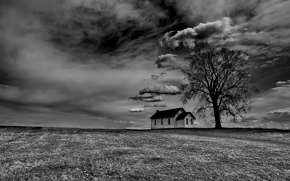
For the next edit I decided to take a little risk with contrast. I chose to lighten the foreground and darken/desaturate the background giving a
different look to the photo--more of a front-lit look. I lightened the house a little and darkened the tree. Just a different take on the same photo. I
liked this version's contrast offered and it gives off a different mood. In comparing the two I honestly do not have a preference and as the State Fair contest approaches, I will have to decide which edit will catch the eye of the judge. Some other enhancements made in both these were to sharpen the house and foreground clouds and remove the noise in the clouds which softens the background clouds a little and gives the 3-D separation between the foreground and background clouds.
 schoolhouse bw std
My next edit is first Black and White--this photo screams to be black and white and for this photo I converted the second photo. When I convert a photo I choose to de-saturate each color independent of each other rather than using the 'convert to black and white' tool in the editing software. I apply lighting changes to each color independently as I desaturate as to maintain tonal control rather than depending on the software to make the changes for me. a little tonal changes once converted--lightening up the foreground but keeping the same feel of the photo it was converted from.
 schoolhouse bw low key
Next I decided to try a little low-key. Basically an under-exposed photo or in layman's terms, darkening the photo. This gives me a little more moody, dismal, bad weather look. If I were to make any changes in this edit it may be to lighten the house just a little bit. I have some photography friends that produce amazing results with low-key black and white--I am still trying to find my groove but this edit gets me closer to finding the right look.
 schoolhous minimalist final
Maybe my favorite photography is minimalist so it is natural that I would try a minimalist conversion for this photograph. This is the edit that took me the longest to achieve. To get the look I basically have to selectively bleach the photograph, losing all elements other than what I want to highlight. I don't count but this is about a 10 step process I do with agressive lightening that cannot be done with one step. I also will mask elements along the way and use a combination of erasing and desaturating isolated elements to get the desired look. For this photo I actually combined the foreground of my second edit with the background of my first black and white edit. I added some shadowing to the foreground and played with the roof a little to bring some texture to it. Minimalist photography is a different art form but one that I continue to fall in love with.
schoolhous minimalist final
Maybe my favorite photography is minimalist so it is natural that I would try a minimalist conversion for this photograph. This is the edit that took me the longest to achieve. To get the look I basically have to selectively bleach the photograph, losing all elements other than what I want to highlight. I don't count but this is about a 10 step process I do with agressive lightening that cannot be done with one step. I also will mask elements along the way and use a combination of erasing and desaturating isolated elements to get the desired look. For this photo I actually combined the foreground of my second edit with the background of my first black and white edit. I added some shadowing to the foreground and played with the roof a little to bring some texture to it. Minimalist photography is a different art form but one that I continue to fall in love with.
 schoolhouse sepia
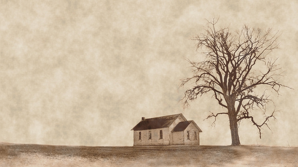
For my final edit I decided to use the "old school" preset that is included with the software--AcdSee comes with about 40 special effect presets that I seldom use but I wanted to do a sepia rendition of this photo and for that I need to go to their special effects. When I saw the preset for Old School, I decided to give it a go. I imagine a photographer could have taken this same photo 130 years ago when the schoolhouse was built--of course the tree would have been just a sapling.
Not every photograph ends up with six different edits--but many times I will try different edits and compare the two before deciding what to enter in a contest or upload. I find it fascinating how an edit can totally change the feel, emotion and mood of a photograph. Thank you for visiting my blog and feel free to contact me at any time with questions or comments.
UPDATE APRIL 16, 2019. I have received great feedback on this blog. A couple of suggestions is that the tree distracts from the schoolhouse. I also wanted to get a "Big Sky" look so I took on two new edits. The first was to crop to gain maximum sky and to put the subjects as far right as possible--This is partially for a photo contest on "Open Spaces" so this the first edit fits the theme. Second edit is off that same photo and removing the tree--quite a daunting task that required me to rebuild the cloud structure behind the tree and make it look all natural. No edit is perfect and this one certainly is not but I gave myself an hour to get it done and it is pretty close to my vision--here are the updated edits;
 wide open spaces 1
16x9 aspect ratio with enhancements to the sky as the primary edit.
wide open spaces 1
16x9 aspect ratio with enhancements to the sky as the primary edit.
 wide open spaces 6
16x9 aspect ratio. Remove tree and rebuild cloud structure behind tree. Same photo as above but a little higher contrast in the field in front of the schoolhouse.


